A Better Font List
Finding the perfect font can be tedious. We've created a smarter font list that is sorted by visual similarity using visual transformers. This approach saves designers time and effort and helps them quickly skim visual groups in the font catalog or even find fonts that are similar to the ones they want to replace. Find out how this works and how you can try it out for yourself in the full article.
Fonts are fashion for your words
Fonts are like fashion for your words. Just like a sharp suit makes a person stand out from the crowd, the right font can take your design from “meh” to “memorable”. Even if a designer has an idea of the font they want (e.g. “I need something like Oswald, but a little softer”), there is no effective way to search for such fonts. Most programs simply display the fonts in dropdowns sorted by name, and some allow you to filter the font lists by attributes such as sans serif or geometric, but that's still pretty useless for this task.
The problem with font search
What we need is a list of fonts sorted by visual similarity, not by font name. Such a list would represent the entire font collection in a coherent way, making the search for visually similar fonts trivial and saving designers hours of searching through font collections.
Leveraging Visual Transformers
It's well known that neural networks and visual transformers can capture the visual properties of objects and represent them in the form of vectors. This ability allows us to use the internal representation of visual transformers to define the visual distance between fonts. In this way, we can seamlessly find and order fonts based on their visual similarity, saving designers hours of searching through font catalogs.
How It Works
Gathering the Fonts
Google Fonts was the obvious choice for this project: comprehensive, free and widely used. To keep things focused, only Latin script and regular fonts were included in the list, which includes over 1600 fonts. A simple Python script takes care of the download process. Note: You need a Google Font API key.
Extract font glyphs
Once we have the fonts, the next step is to extract the individual characters. Since we are working with Latin fonts, we take all the letters of the Latin alphabet (upper and lower case) and special characters such as @, ? and ! These characters help reveal the visual identity of each font.
We convert these individual characters into images, which are fed into the visual transformer in the next step. We also calculate the glyph density (essentially the 'blackness' of the font, i.e. the proportion of black dots in the glyph's bounding box), which will be useful later.
You can find the details of this process in the corresponding script.
Using Vision Transformers
Once we have images that represent each character (glyphs centered in the image), the images are fed into Vision transformer.
The magic lies in the process. Here you can see how it works step by step:
- Image Input: Vision Transformer receives and processes an image.
- Classification Attempt: During this processing, the Vision Transformer attempts to classify the image and determine what it represents.
- Internal State Configuration: During the classification of the image, the internal state of the Vision Transformer is converted into a unique state specific to that image.
- Feature Extraction: This internal state, specifically the output of the final layer of the Transformer encoder, captures high-level features of the image.
- Vector Representation: These features, represented as number vectors, provide a detailed representation of the visual properties of the font.
We present images of the individual font characters to the Transformer and extract the corresponding feature vectors. These vectors encapsulate the unique visual characteristics of each font and allow for detailed font comparisons. They even allow us to determine the distance between fonts.
One note: Because the Vision Transformer analyzes individual glyphs, it does not capture the relationships between pairs of characters, which is important for certain fonts (e.g., Flavors, where 'q' and 'j' are high above the baseline). To solve this problem, we present the Vision Transformer with images of the sentence “The quick brown fox jumps over a lazy dog” for each font.
Measure similarity
Happy times: We have now paired fonts with their corresponding feature vectors. If everything works as expected, feature vectors that are close to each other represent visually similar fonts, while vectors that are far apart represent visually different fonts.
Finding a font that is similar to the selected font F is easy. You simply measure the distance (e.g., Euclidean, cosine, etc.) between the feature vector of F and the feature vectors of all other fonts in the collection and then select the n fonts with the closest feature vectors. Let’s put this to the test with Orbitron and Oswald fonts:
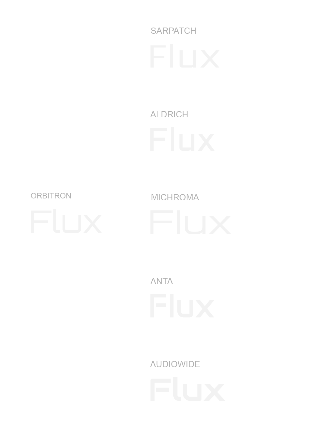
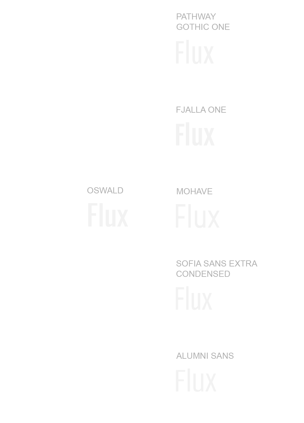
Not bad at all. The Vision Transformer’s internal state vectors seem to accurately represent the visual landscape of the fonts.
The fonts similar to Orbitron (Sarpatch, Aldrich, Microma, Anta, Audiowide) are characterized by geometric shapes, clean lines and a futuristic appearance and are therefore well suited to modern and technology-oriented applications.
The Oswald-like fonts (Pathway Gothic One, Fjalla One, Mohave, Sofia Sans Extra Condensed, Alumni Sans) are characterized by condensed structures, a strong presence and good legibility and are therefore ideal for headlines and impactful textual presentations.
Try it out for yourself: select a font from the dropdown menu and view similar fonts from the Google Fonts collection.
Google Fonts
Visual Similarity
Creating the list of fonts
Now that we can find visually similar fonts, it should be easy to create a list sorted by visual similarity, right? Just find the shortest path that includes all fonts and call it a day. We have feature vectors representing fonts and can compute distances. Easy, right? Wrong! Unless the number of fonts is very small, this quickly becomes a nightmare (thanks to NP-hard problems).
So how do we tackle this? The usual trick with NP-hard problems is to abandon the search for an optimal solution and settle for good approximations. One approach is to start with the most visually distant pair of fonts and set one of them as the start of our path. In each iteration, we then extend the path by the font that minimizes the visual distance to the last font in the path. This method already gives pretty good results.
But we can do even better. We can further improve the list by iteratively repositioning each font, as long as this reordering shortens the overall path. If you're interested in the details, you can check out the code.
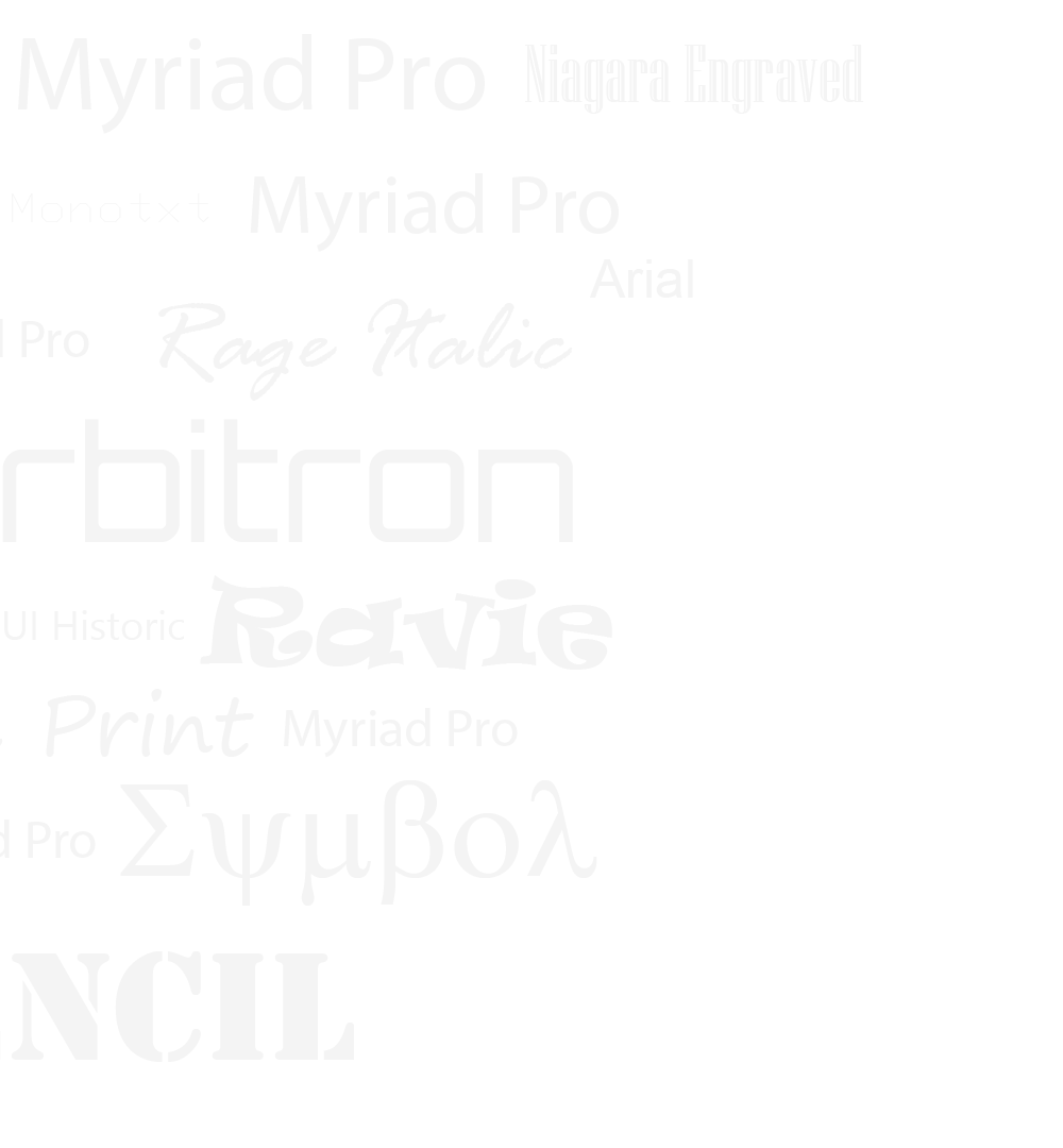
The result? A visually sorted list of Google Fonts that contains only regular, Latin subsets. The list is locally homogeneous, i.e. similar fonts and font groups are joined together in long streaks. However, there are still cases where a few separated streaks could be merged for better visual coherence.
Using these approximation techniques, we have managed to create a clearer and more visually intuitive font list, making it easier for you to find the perfect font for your next project.


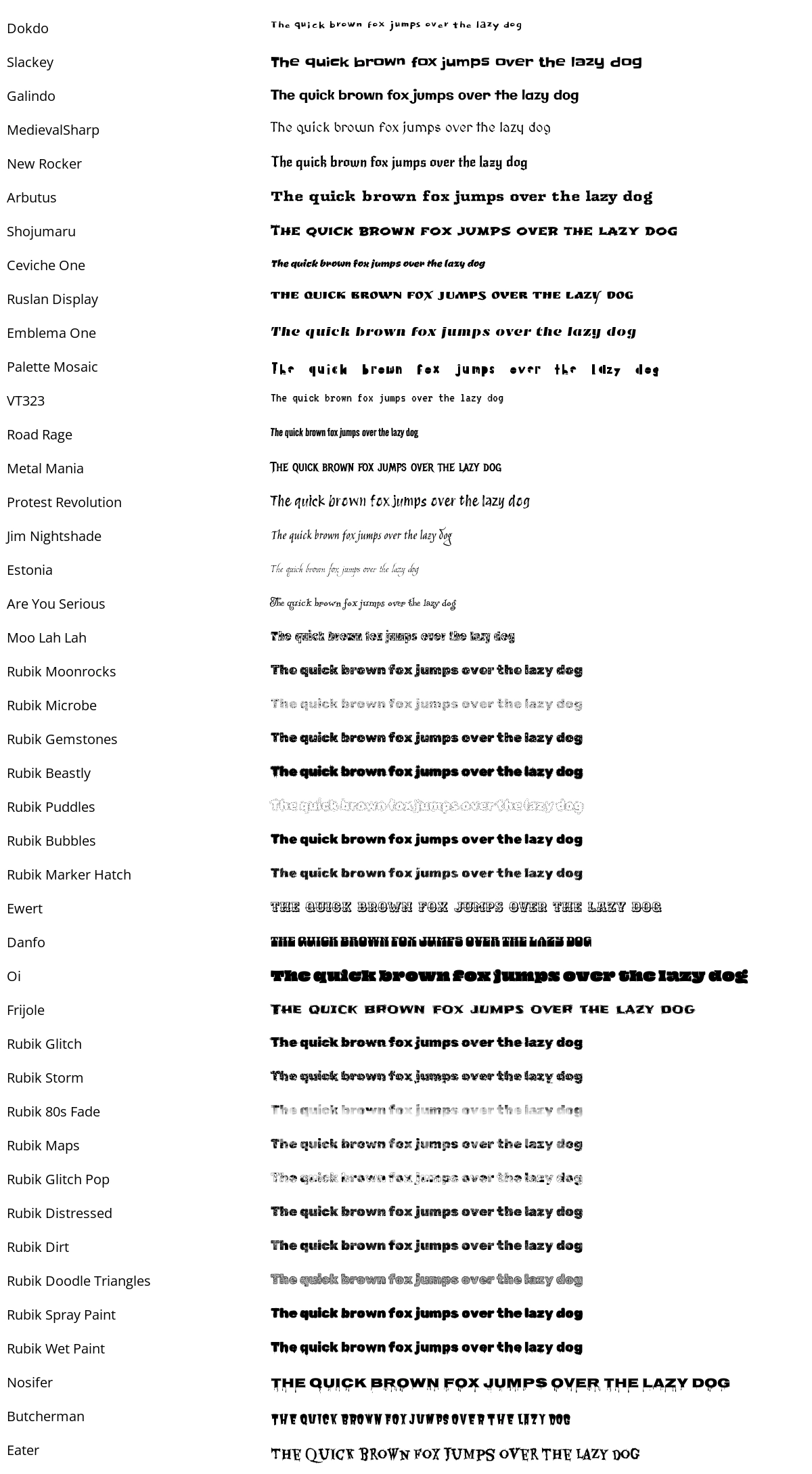
Another challenge is that visual transformers focus primarily on the shapes of objects rather than the thickness of strokes. This can lead to thin and thick fonts being mixed in the visual similarity list. To avoid this, we separated the fonts in the visually sorted list according to their thickness. We calculated the glyph density, which measures the ratio of black dots to the bounding box size of the character glyph, and divided the fonts into four quartiles based on the average glyph density of the characters. This resulted in four font lists: Featherlight, Thin, Regular and Bold. This classification helps to create more visually coherent groups, making it easier for you to choose the right font for your needs.
Featherlight

Thin

Regular

Bold

Why it matters
A list of fonts ordered by visual similarity saves designers a lot of time and effort. Instead of spending endless hours browsing font catalogs, you can quickly find the fonts that match your design vision. Have a specific look and feel in mind (e.g. need a font similar to Oswald)? Simply find the fonts that are most visually similar to Oswald and choose one. If you're still in the brainstorming phase, you can skim the visually sorted list of fonts and see what catches your eye.
And if you want to use this for your own fonts or other variations of Google fonts (e.g. italics, slabs, etc.), you can clone the project and experiment with it.
Boost Your Design Process with ideatum.ai
This is where ideatum.ai comes into play. Our platform not only helps you find visually similar fonts, but also generates mood boards, font pairings and complete style guides from simple prompts. With ideatum.ai, you can streamline your design workflow, create stunning visuals, and share your work seamlessly across platforms like HTML, Webflow and Figma.
Try ideatum.ai today and improve your design process with smart, efficient font selection and much more. We welcome your feedback and suggestions so we can better customize our tools to meet your design needs.